Round-ups average $4.80; the streak counter says $40
Why a $4.80 average round-up and a $40 streak counter tell the real story of habit design in consumer payments and how people think about money
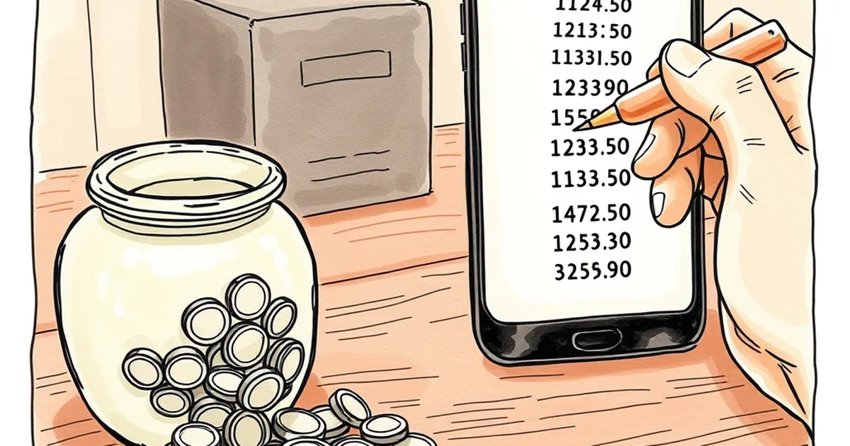
The average round-up on a card transaction sits somewhere around $4.80. The streak counter on the same app says the user has saved $40 this month. Both numbers are true, and the gap between them is where the most interesting design work in consumer payments is happening right now. What turns a rounding rule into a habit, and what does that habit do to the way people think about money?
The round-up is a pricing trick that doesn't feel like one
Spare-change rounding is one of the oldest ideas in retail banking, and it works because it borrows a mechanism from behavioral economics rather than from finance. When a purchase of $3.20 becomes $4.00 and $0.80 moves to savings, the customer hasn't made a budgeting decision. They've made a purchase, and a small, almost invisible amount of money has been redirected.
That invisibility is the point. Richard Thaler's work on mental accounting describes how people sort money into separate pots — salary, windfall, "money I don't touch" — and treat each pot with different rules. A round-up slips into the savings pot without ever passing through the spending pot, so it never triggers the internal negotiation that a $40 transfer would.
The $4.80 average matters for a second reason: it's small enough to be below most people's threshold for noticing. Research on just-noticeable differences in pricing suggests consumers are far more sensitive to changes they can perceive than to changes they can't. A round-up is engineered to stay under that line. A $40 monthly transfer is not.
Where the streak counter changes the math
A streak counter is a different animal entirely. It converts an invisible behavior into a visible one, and visibility changes what the behavior is for.
B.F. Skinner's variable-ratio schedules of reinforcement — the pattern where a reward arrives after an unpredictable number of responses — produce the most persistent behavior of any schedule studied. Streak mechanics don't use variable ratios directly, but they borrow the same engine: the user doesn't know exactly when the milestone will land, only that continued action keeps the possibility alive. Add a visible counter and a "don't break the chain" norm, and you've added a second, social layer on top of the financial one.
This is where the $4.80 and the $40 start to diverge. The $4.80 is a financial fact. The $40 is a narrative fact — a story the app is telling the user about who they are. "You are someone who saves." That story is doing more motivational work than the money is.
There's a real risk in that. Daniel Kahneman and Amos Tversky's work on loss aversion established that losses loom larger than equivalent gains. A streak counter weaponizes exactly that asymmetry: breaking a 47-day streak feels like a loss, even though the user loses nothing material. The counter is, in effect, manufacturing a loss to prevent.
The concrete case: when the streak outruns the savings
Consider a common pattern reported by product teams at neobanks and savings apps. A user sets up round-ups, watches the counter climb, and after several weeks feels a sense of accomplishment tied to the streak number rather than the balance. The app surfaces "You're on a 62-day streak!" prominently and the actual saved amount less so. The user, reasonably, infers that they've saved more than they have — because the number that's growing fastest is the one about consistency, not currency.
Then a real expense arrives. The user checks the savings pot expecting a cushion and finds $180, not the $600 the streak narrative implied. The disappointment isn't really about the money. It's about a broken mental model. And broken mental models are expensive: they erode trust in the product faster than a bad interest rate does.
The design lesson isn't to remove the streak. It's to keep the two numbers in the same visual frame so the narrative and the fact stay tethered. Apps that show streak and balance side by side, with equal prominence, tend to see better retention and fewer support tickets about "missing" money.
Round-ups as a decision-making exercise
There's a more optimistic read of this overlap. Round-ups are one of the few consumer finance products that train a genuine decision-making skill: the ability to commit to a rule in advance and let it run without re-litigating it every month.
That's the same skill that shows up in research on implementation intentions — the finding, associated with Peter Gollwitzer, that people who specify when and how they'll act are substantially more likely to follow through than people who merely intend to. "I will save" is an intention. "Every purchase rounds up to the next dollar" is an implementation intention with a built-in trigger. The trigger is the transaction itself, which is why round-ups outperform manual transfers for a large share of users.
Seen this way, the streak counter isn't a gimmick bolted onto a savings feature. It's a feedback mechanism for a rule the user has already chosen. The problem is only when the feedback loop becomes the product and the rule becomes background noise.
What payment networks are likely to do with this
The interesting frontier is at the network layer, not the app layer. Card networks already see every transaction in real time, which means they can compute round-up opportunities without waiting for a batch settlement. That opens the door to round-ups that adapt: larger rounding on discretionary spend, smaller on essentials, and a running total that's always accurate rather than estimated.
The behavioral question that comes with it is whether adaptive rounding helps or hurts. A round-up that changes size based on merchant category is more efficient, but it's also more visible, and visibility is exactly what made the $4.80 work in the first place. There's a real tension between optimizing the amount and preserving the invisibility that makes people tolerate the amount.
My guess is that the winning designs will keep the transaction-level round-up as quiet as possible and put all the visible energy into a single, honest number that reconciles streak and balance. The counter can celebrate consistency. It just can't be allowed to imply a balance that isn't there. The $4.80 and the $40 both belong on the screen — and the user should never have to guess which one is the money.