Progress splits at 70%; the risk toggle waits 9 screens
Why a progress bar frozen at 70% triggers checkout abandonment, and how the risk toggle nine screens later quietly reshapes user decisions
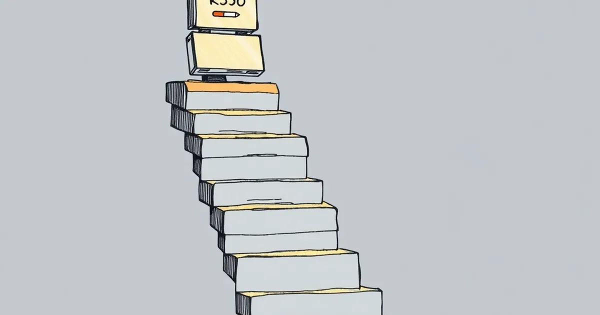
Seventy percent. That's the number a payment product manager stares at when a progress bar freezes, and it's also the number where a surprising share of cardholders abandon a checkout flow they were perfectly willing to finish ninety seconds earlier. Not because the price changed. Not because the card declined. Because somewhere between "confirm" and "done," the interface asked them to make a decision they didn't expect to make.
The question worth sitting with: why do we treat a progress indicator as a neutral courtesy, when it's actually a decision architecture — one that quietly determines whether someone finishes, hesitates, or walks away?
The 70% cliff isn't about patience
Progress bars feel like they belong to engineering, not psychology. But the research on goal gradients goes back further than most fintech teams realize. Clark Hull's work in the 1930s on goal-gradient behavior showed that organisms speed up as they approach a reward — rats ran faster down a runway the closer they got to food. Later, in a now-famous 2006 study of coffee shop loyalty cards, Ran Kivetz, Oleg Urminsky, and Yuhuang Zheng found that customers accelerated their purchases as they neared a free drink. The pull of completion is real and measurable.
So why does momentum stall at 70%?
One answer: that's where the cost of the remaining work becomes visible. The first half of a checkout flow is mostly confirmation — you're verifying what you already decided. The last third is where you're asked to commit: enter a one-time code, confirm a billing address, approve a merchant you don't recognize, accept a currency conversion. Each of those is a small decision, not a mechanical step. And decisions, unlike typing, draw on a finite resource.
Roy Baumeister's ego-depletion work (much debated since, but still useful as a lens) suggested that self-regulatory capacity depletes with use. You don't need to accept the strong version of that claim to notice the practical pattern: a person who has already made eight small decisions in a checkout is measurably less willing to make a ninth than someone who has made two.
The risk toggle and the nine-screen problem
Here's the specific case that keeps coming up in payment design reviews. A user is moving through a flow — say, adding a new funding source to a wallet — and at screen nine, they hit a toggle. It says something like: Enable risk-based verification. This may occasionally require additional confirmation.
Nothing about that toggle is technically scary. It's a feature. But it's placed at the exact moment when the user's mental model has already been built: I'm almost done. The toggle introduces uncertainty about what "occasionally" means, and uncertainty late in a sequence is disproportionately expensive. Kahneman and Tversky's loss aversion work explains part of this — a potential future friction is weighted more heavily than an equivalent present convenience. But there's a subtler mechanism too.
Variable-ratio reinforcement, the schedule B.F. Skinner documented in the 1950s, teaches organisms that rewards arrive unpredictably. That's powerful when the reward is desirable. It's corrosive when the cost is unpredictable. A user who has been told "sometimes you'll be asked to confirm again" is now anticipating a random tax on their time. Most will disable the toggle. Not because they've weighed the tradeoff, but because they've been handed an unresolved question at the worst possible moment.
The fix isn't to remove the toggle. It's to move it.
What banks get wrong about "informed consent"
There's a well-intentioned instinct in financial regulation and product design alike: put the consequential choice in front of the user, explain it clearly, and let them decide. That instinct is correct in spirit and often wrong in sequencing.
A concrete example from card networks: when 3-D Secure authentication — the "Verified by Visa" / "Mastercard Identity Check" step — was first rolled out broadly, abandonment rates in some markets spiked dramatically. The step itself was necessary for fraud liability reasons. But placing it after the user had mentally concluded the transaction created a jarring re-entry into decision mode. Over time, many issuers moved to risk-based authentication that only challenges high-risk transactions, and abandonment fell. The lesson wasn't "remove friction." It was "stop interrupting the completion arc."
The same principle applies to the risk toggle. If the decision must be made, make it before the user has invested in finishing — ideally at the point where they're still forming their mental model of the flow. A toggle at screen two reads as configuration. A toggle at screen nine reads as a trapdoor.
Designing for the moment before the freeze
What does this look like in practice?
Front-load consequential choices. If a setting will change what happens later, surface it early. Users tolerate complexity at the beginning of a flow and resent it at the end.
Convert decisions into defaults where the risk is low. Opt-out is not always ethical, but for reversible, low-stakes settings, a sensible default with a visible "change" link respects the user's attention budget better than a mandatory toggle.
Never introduce a new question during the completion arc. The last 30% of a flow should be pure execution. If a new variable appears there, it should be a confirmation, not a choice.
Measure abandonment by screen position, not just overall. A 4% drop at screen three is noise. A 4% drop at screen nine is a signal that you've interrupted momentum.
Watch for "occasionally" and "may require." These phrases are honest, and they're also decision-killers late in a sequence. If the behavior is rare, consider handling it silently and notifying after the fact.
Where this is heading
Open banking, real-time payments, and tokenized credentials are all pushing more decisions into the payment moment — which account, which currency, which verification level, which merchant consent. The temptation will be to expose each of those as a user choice, because transparency feels safe.
But transparency has a shape, and shape matters. A choice offered at the right moment is empowering. The same choice offered nine screens in, after the user has already decided to finish, is a small act of friction that compounds across millions of transactions into measurable revenue loss and measurable user frustration.
The next generation of payment design won't be won by whoever offers the most control. It'll be won by whoever understands when control should be offered — and when the kindest thing you can do is let someone finish what they started.