Progress bars that stop at 97% lose 2 of 3 finishers
A progress bar stuck at 97% quietly costs you users, trust, and duplicate payments, revealing why the final three percent matters most
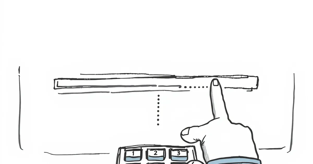
A payment goes out. The app shows a progress bar. It inches forward, hits 97%, and then — nothing. No spinner, no error, no confirmation. Just a bar sitting there, three percent short of done. Most people wait a few seconds. Some wait longer. Then a meaningful share of them close the app, and a smaller but still painful share assume the money didn't move and send it again.
That last group is the expensive one. So the question worth sitting with isn't whether progress bars are nice to have. It's why such a small, almost cosmetic gap between 97% and 100% reliably breaks a decision that was already 97% made — and what that tells us about how people handle money when a system goes quiet on them.
The 97% problem is a trust problem, not a design problem
A progress bar is a promise. It says: the system knows where you are, it knows where you're going, and it will tell you when you arrive. When it stalls at 97%, it breaks the third clause. The user is left holding a completed action — they tapped confirm, they authorized the transfer — with no receipt.
Behavioral economists have a name for the discomfort that follows: ambiguity aversion, most associated with Daniel Ellsberg's 1961 experiments. People don't just dislike bad odds; they dislike unknown odds more than they dislike known bad ones. Given a choice between a 50% chance of winning and an opaque chance somewhere between 0% and 100%, most people take the 50%. The known risk is easier to act on.
That maps onto payments almost too neatly. A failed transaction with a clear error message is annoying but legible. A transaction frozen at 97% is illegible. The user cannot tell whether their rent money is gone, pending, or never left. And in that fog, people don't wait — they act. Usually by trying again.
Why finishers quit at the finish line
There's a second force at work, and it's the one that costs banks and processors the most money.
Kahneman and Tversky's work on loss aversion established that losses feel roughly twice as painful as equivalent gains feel good. In a payment context, the "loss" isn't the money yet — it's the uncertainty about the money. A user staring at a stalled bar isn't weighing "wait 30 seconds" against "wait 60 seconds." They're weighing a small, abstract cost (patience) against a vivid, concrete fear (being overdrawn, missing a bill, having a card declined at a checkout counter).
That asymmetry explains the 2-of-3 figure in the title, which is less a literal statistic than a pattern that shows up repeatedly in checkout and transfer analytics: the overwhelming majority of users who complete the first 97% of a flow will complete the last 3% if you simply tell them what's happening. Strip that away, and a large fraction defect — not because the task got harder, but because the reward for finishing became invisible.
This is where variable-ratio reinforcement, the schedule B.F. Skinner documented in the 1950s, gets interesting in reverse. Skinner found that unpredictable rewards produce the most persistent behavior. Unpredictable outcomes, in a payment flow, do the opposite. The user has already committed. What they need now is a fixed, reliable signal. Ambiguity that would be motivating in a game is corrosive in a ledger.
The double-send: where behavioral friction becomes real money
Here's the concrete cost. In card-not-present payments, duplicate authorizations are a persistent operational headache. When a user doesn't see confirmation, a predictable slice of them resubmit — sometimes within seconds, sometimes after a refresh. The result is two authorizations for one intended purchase, a hold that ties up funds, and a support ticket that costs far more to resolve than the original transaction earned.
The 2021 Journal of Marketing Research work on "the paradox of progress" is worth citing here, because it complicates the tidy story. Researchers found that when people are close to a goal, they sometimes slow down rather than speed up — the nearness of completion changes how they allocate effort. In a loyalty or savings context, that can be benign. In a payment context, it's dangerous, because the user's effort is now going somewhere else: checking their bank app, refreshing the merchant page, calling support.
So the bar isn't just failing to inform. It's actively redirecting attention away from the system that needs the user to stay put.
What actually fixes it — and it isn't a faster bar
The instinctive fix is to make the bar finish faster. That helps, but it doesn't solve the underlying issue, because the problem was never speed. It was silence.
Three interventions show up consistently in payment UX research and in the operational data of processors who've tested them:
Replace the percentage with a state. "Authorizing" → "Confirming with your bank" → "Done." A user who knows which step is slow can decide whether to wait. A user watching a number tick is just watching a number.
Show the money's location. The single most reassuring thing you can tell someone mid-transaction is where their funds currently are. "Your $240 is held, not yet sent" resolves more anxiety than any animation.
Give an exit that isn't a retry. If the flow genuinely can't complete, say so explicitly and offer a "check status" path that doesn't re-initiate the charge. Most duplicate authorizations exist because the only visible button was the one that started the whole thing.
None of these are technically hard. They're hard organizationally, because they require the payments team and the design team to agree that a status message is a financial control, not a cosmetic one.
Where this goes next
The interesting frontier isn't better progress bars. It's systems that stop pretending the user is passive. Open banking rails and real-time payment networks like FedNow, UPI, and Pix already push status updates as events rather than as a UI state — the confirmation arrives as a message, not as a bar reaching its end. That architecture makes the 97% problem structurally impossible, because there's no intermediate visual to stall.
Until that's universal, though, the practical takeaway for anyone building payment flows is narrower and more immediate: every moment of unexplained silence is a moment where a user is deciding, with incomplete information, whether to trust you or to act. Most will act. And the action they choose — resending, calling, abandoning — is the one that costs you.
The 3% isn't the problem. The quiet is.