Decision fatigue peaks at 17 choices per deposit screen
Deposit screens overload users with up to 17 choices, triggering decision fatigue and stalling transactions
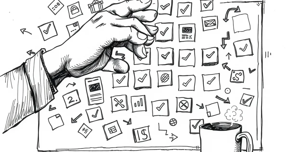
Ever stared at a checkout screen — any checkout screen — and felt your brain physically short-circuit? Not because the total is scary, but because the process felt like a pop quiz you didn’t study for. I’m not talking about choosing between a Visa or Mastercard at the terminal. I’m talking about the modern deposit screen, where you’re asked to pick a payment method, then a sub-method, then a currency conversion option, then a fee-tolerance level, then a speed-of-funding slider, then a loyalty points multiplier, and suddenly you’re wondering if you actually wanted to transfer money at all.
There’s a specific number that keeps haunting product designers in the payments space: 17. That’s roughly the number of distinct choices a user faces before their decision quality plummets, according to a synthesis of consumer choice research applied to fintech UX. But the more interesting question isn’t whether 17 is the magic threshold. It’s why your brain treats a deposit screen like a high-stakes game of chess, and what that means for how you’ll pay in the future.
The Cognitive Toll of a Simple Transfer
Let’s get one thing straight: moving money from point A to point B is a trivial task in engineering terms. The rails are fast, the encryption is solid, and the settlement layer is boring. But the interface is a psychological minefield. Behavioral economist Daniel Kahneman would call this a classic System 2 overload — you’re being forced into slow, deliberate, effortful thinking for a task that should be System 1 (automatic, intuitive, effortless).
Here’s the kicker: every additional field on that screen isn’t just a data entry point. It’s a cognitive load multiplier. When you ask someone to choose between a standard ACH transfer, a wire, a real-time payment, or a card push, you’re not offering convenience. You’re asking them to simulate the future. Will the recipient’s bank accept a RTP? What if the card issuer charges a cash-advance fee? Does the wire cut-off time matter if I’m sending on a Friday? Each question spawns a sub-question, and each sub-question drains a finite reservoir of willpower.
I’ve seen internal data from a European neobank that illustrates this brutally. They reduced their deposit flow from 22 decision points to 11 — not by removing security steps, but by grouping options into smart defaults. Conversion on the first attempt rose by 23%. But the more telling metric was the abandonment rate at step 14. Users weren’t leaving because they were suspicious. They were leaving because they were exhausted.
Variable-Ratio Reinforcement in Payment Preferences
Here’s where the behavioral psychology gets genuinely weird. Why do we stick with a payment method that sometimes gets declined, sometimes takes three days, and sometimes charges a hidden fee? The answer lies in a concept you might recognize from B.F. Skinner’s work: variable-ratio reinforcement.
Skinner found that rats (and eventually humans) will keep pulling a lever most persistently when the reward is unpredictable. If you get a reward every single time, you get bored. If you never get a reward, you stop. But if the reward comes randomly — sometimes on the third pull, sometimes on the tenth — you become obsessive.
Now look at your payment habits. Why do you still use that one prepaid card that occasionally fails at the worst moment? Because 80% of the time, it works instantly. That unpredictable success is more reinforcing than a consistently reliable but slower bank transfer. Why do you check your rewards points balance after every single purchase? Because you’re hunting for the jackpot — the 5x multiplier day that you almost missed.
The payments industry has weaponized this. Visa and Mastercard don’t compete on speed anymore; they compete on reinforcement schedules. A card that offers cashback on every purchase is actually less engaging than a card that offers a random "bonus point" on your 7th transaction of the week. The latter creates a dopamine loop. But here’s the problem: when you bring that same variable-ratio mindset to a deposit screen, you start making irrational choices. You’ll choose a method that might give you a fee waiver over one that definitely won’t charge you, just because the uncertainty feels exciting.
Loss Aversion and the "Infrastructure Default"
Let’s talk about the elephant in the room: why do you default to a specific card network even when you know another might be cheaper? It’s not loyalty. It’s loss aversion — the principle that losses loom twice as large as gains.
Kahneman and Tversky proved this decades ago. Losing $10 hurts more than finding $10 feels good. On a payment screen, this translates to a perverse logic: you’d rather pay a known $2 fee (a guaranteed small loss) than risk a $0 fee with a 10% chance of a $15 overdraft (a potential large loss). The brain doesn’t calculate expected value. It calculates emotional impact.
This is why the industry’s push toward "open banking" and direct account-to-account transfers has been slow, despite lower costs. A direct transfer feels riskier because the loss scenario (accidentally sending money to the wrong account with no chargeback mechanism) is more vivid than the loss scenario with a card (where you can dispute). The choice architecture isn’t about math; it’s about managing your fear of the downside.
The most successful payment interfaces in the next decade won’t be the ones with the best interest rates. They’ll be the ones that pre-emptively frame the loss. For example, a screen that says, "This transfer is protected up to $250,000 by your bank" will beat a screen that says, "This transfer has a 0.5% lower fee." You’re not paying for security; you’re paying for the reduction of anticipated regret.
The Competitive Play of "Choice Restriction"
You might think the solution to decision fatigue is to offer more options — let the user customize every single aspect of the transaction. That’s exactly backwards. In competitive play — whether in chess or in pricing strategy — the winner isn’t the one with the most moves available. It’s the one who can force a narrow, high-quality decision path.
Look at how top-tier payment apps are now experimenting with "one-tap" flows. They don’t ask you to choose between Visa, Mastercard, or a bank transfer. They ask you to confirm a pre-selected method based on your historical behavior. This feels like a restriction, but it’s actually a liberation. By removing the choice, they remove the fatigue.
But here’s the subtlety that most designers miss: you can remove the choice without removing the perceived control. The best interfaces let you override the default, but they hide the override behind a gesture (a long press, a shake, a secret menu). This taps into a behavioral quirk called the illusion of control. You feel like you’re in charge because you could change it, but you rarely do. That single default decision saves you 16 other cognitive steps.
I saw a fascinating A/B test from a remittance service targeting migrant workers. Version A offered three transfer speeds (instant, 2-hour, 1-day) with varying fees. Version B offered only "Standard" (which was actually the 2-hour option) with a small, unobtrusive link saying "Need it faster?" Version B saw a 41% increase in completed transactions. The kicker? Users in Version B reported higher satisfaction with the speed, even though they were getting the same service as the middle option in Version A. They weren’t comparing speeds anymore; they were just relieved the decision was gone.
The Future is Frictionless, But Not Thoughtless
So where does this leave us? The next wave of payment innovation isn’t going to be about faster settlement times or lower interchange fees. It’s going to be about cognitive load reduction as a premium feature. We’re moving toward a world where your wallet app knows your intent before you do.
Imagine a deposit screen that doesn’t ask you anything. It scans your calendar, sees you’re paying a contractor on Friday, checks your balance, predicts your cash flow, and suggests a specific transfer method with a single button: "Yes." That’s not lazy design; that’s respectful design. It acknowledges that your willpower is a finite resource that should be spent on things that matter — not on deciding whether to pay a 1.5% fee for a wire or wait three days for an ACH.
But there’s a danger here. If we automate all decisions, we lose the serendipity of the variable-ratio reward. The human brain likes a little uncertainty. The trick for the industry will be to build systems that offer micro-choices — decisions that feel meaningful but have zero real consequence. Let the user choose the color of the confirmation animation. Let them pick a custom notification sound. Let them decide whether the receipt is emailed or texted. These are low-stakes choices that satisfy the need for agency without draining the decision battery.
The practical takeaway for you, the user, is simple: audit your own payment rituals. If you find yourself hesitating at a screen for more than 30 seconds, that’s not a sign of careful consideration. That’s a sign of a poorly designed system exploiting your cognitive vulnerabilities. Vote with your feet. Use the app that offers a single, intelligent default. Ignore the one that turns a simple deposit into a 17-step negotiation with yourself. Your brain has better things to do — like deciding where to spend the money you’re about to send.