Auto top-up runs to day 90; the manual save breaks at day 4
Auto top-up reaches day 90 while manual saving fails at day 4, revealing what standing payment instructions do to behavior and product design
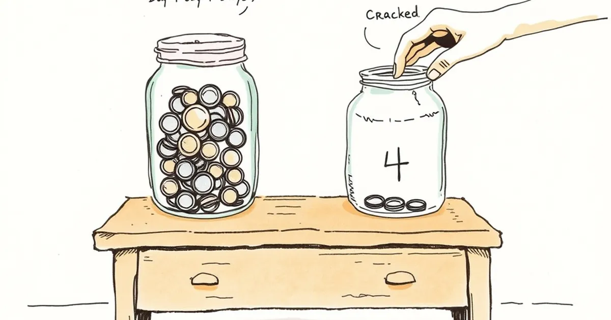
Auto top-up runs to day 90; the manual save breaks at day 4. If you run payments, that pair of numbers should bother you — not because the gap is surprising, but because it's so reliably reproducible across markets, products, and income levels. So here's the question worth sitting with: what exactly does a standing instruction to move money do to a person's behavior that a manual decision cannot, and what does that tell us about how payment products should be designed?
The four-day cliff is not a discipline problem
When a saver has to act every time — open the app, confirm the amount, tap through — the behavior decays fast. Day one is easy. Day four is where the friction compounds: a forgotten password, a low-balance warning, a busy morning, a small doubt about whether this month is the right month to move money. Each of those is a tiny decision point, and each decision point is a chance to say "later."
The auto top-up has no decision points after setup. It runs on rails the customer laid down once and then stopped thinking about. That asymmetry is the whole story, and it's not about willpower. It's about where the decision lives in time.
This is the same mechanism behind what behavioral economists call present bias — the well-documented tendency to overweight immediate costs and underweight future benefits. A manual save asks someone to feel a cost now (effort, attention, a moment of doubt) for a benefit later. An auto top-up front-loads the effort into a single setup moment and then removes the recurring cost entirely. The person hasn't become more disciplined. The product has stopped asking them to be.
Variable rewards, but not the kind you're thinking of
There's a reason recurring payment design borrows language from behavioral psychology, and it's worth being precise about which research actually applies.
B.F. Skinner's work on variable-ratio reinforcement showed that behavior rewarded unpredictably is more persistent than behavior rewarded on a fixed schedule. That finding gets cited constantly in consumer product circles, often loosely. In payments, the honest application is narrower: unpredictability in outcomes is corrosive to trust, but predictability in timing is what makes a habit stick. Auto top-up works because it is boring. The customer knows it will happen, roughly when, and for how much. The reinforcement is the absence of a decision, not a surprise.
Where variability does matter is in the trigger. A top-up that fires when a balance crosses a threshold feels responsive; a top-up that fires on the 1st of the month feels administrative. Both work, but they serve different customers. The threshold-triggered version suits people with irregular income — freelancers, gig workers, seasonal earners — because it adapts without requiring them to re-decide. The calendar version suits salaried customers who already think in monthly cycles. Getting this wrong is one of the quiet reasons top-up adoption stalls in emerging markets where income timing is lumpy.
Loss aversion cuts both ways
Kahneman and Tversky's loss aversion — the finding that losses loom roughly twice as large as equivalent gains — is usually invoked to explain why people avoid fees. That's true, and it's why failed-payment charges are such a sensitive design choice. But loss aversion also explains why manual saving breaks.
Think about what a manual save feels like from the inside. You have money in your account. Moving it out feels, momentarily, like a loss — the balance drops, and the drop is visible and immediate. The future benefit is abstract and distant. Loss aversion does the rest. The person isn't being irrational; they're responding exactly as the research predicts to a decision framed as a subtraction.
Auto top-up reframes the same transaction. The money never sits in the spending account long enough to feel owned. The top-up becomes the default state and the spending becomes the deviation. Same money, same direction of travel, different reference point — and the reference point is doing most of the work.
This is why the framing on the setup screen matters more than most product teams assume. "Save $50 a month" and "keep your balance topped up to $500" describe nearly identical mechanics but land very differently. The second framing is about maintenance, not sacrifice.
A concrete case: the round-up that wasn't
A useful reference point comes from the debit round-up experiments that several banks and fintechs ran through the 2010s. The mechanic was simple: round every card purchase to the nearest dollar and sweep the difference into savings. Opt-in rates were healthy. Engagement in month one was strong. And then, in most implementations, the sweeps quietly stopped mattering — average monthly contributions settled into single digits, and a meaningful share of enrolled customers effectively forgot the feature existed.
The diagnosis wasn't that round-ups were a bad idea. It was that the amounts were too small to register as progress, and the feature required the customer to notice it working. Auto top-up avoids both traps. The amount is large enough to move a balance, and the customer doesn't need to notice anything — the balance is simply there when they check.
The lesson generalizes: a payment behavior survives only if it can run without the customer's attention. Anything that depends on the customer noticing, remembering, or feeling good about it has a half-life measured in days.
What this means for how you build the next one
The day-90 versus day-4 gap is a design brief, not a marketing insight. Three things follow from it.
Move the decision to setup, and make setup count. If the only decision a customer makes is the one at enrollment, that screen deserves more engineering attention than the checkout flow. Amount, trigger, timing, and the ability to pause without canceling are the four levers. Most products get the amount right and the pause wrong — and a customer who can't pause without killing the whole thing will kill the whole thing.
Design for the balance, not the transaction. Customers don't experience individual top-ups. They experience the number in their account when they open the app. Optimize for that number being unsurprising and adequate, and the individual mechanics become almost invisible — which is the goal.
Treat every notification as a cost. A top-up that pings the customer every time it runs is reintroducing the decision point the product was built to remove. Silence is a feature. Reserve the alert for the failure case — the moment the rail breaks and the customer needs to act — and you preserve the trust that makes the whole thing work.
The forward-looking question for anyone building in this space isn't how to make manual actions more appealing. It's how many of your product's core behaviors still depend on a customer deciding, repeatedly, to do the right thing. Every one of those is a day-four cliff waiting to happen. The ones you can convert to a standing instruction are the ones that will still be running at day 90 — and the customers who set them up will tell you, if you ask, that they barely remember doing it.